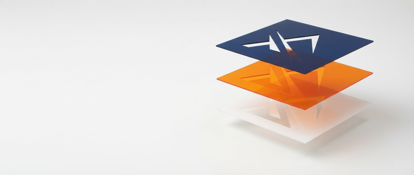
Short answer: Color separation is the process of breaking artwork down into individual color layers, one per ink, so a screen printer can burn a separate screen for each color and print them in register on press. Get the separation wrong and you get muddy colors, bad registration, or a design that simply can't print. Most US print shops need this done before a job ever reaches the press, usually as a production art step ahead of screen burning.
A design can look perfect on screen and still be unprintable. That's usually a separation problem, not a design problem. Before a shirt design goes anywhere near a screen, someone has to decide which inks it needs, how those inks are laid out on the film, and how they'll sit on top of each other on press. That step is color separation, and it's one of the most common reasons a job gets held up or reprinted.
What Is Color Separation?
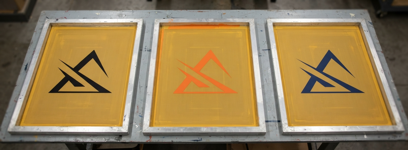
Color separation takes a piece of artwork and splits it into individual layers, one for each ink color that will be printed. Each layer becomes its own screen, and the press lays down one ink at a time, in a specific order, until the layers combine into the finished design on the garment.
This only works if the source artwork is vector-based to begin with, which is why separation and vector conversion usually go hand in hand. If a logo arrives as a raster file, it needs to be rebuilt as clean vector paths first (see our guide to vector conversion) before it can be separated accurately.
Spot Color vs. Process Color vs. Simulated Process
There isn't one way to separate a design. Which method fits depends on what the artwork actually looks like.
- Spot color separation uses one solid, pre-mixed ink per screen, usually matched to a Pantone number. Best for logos, text, and flat-color artwork where consistency matters more than photographic detail. A typical logo job runs 1 to 4 spot colors.
- Process color separation uses four screens, cyan, magenta, yellow, and black (CMYK), printed as overlapping halftone dots to build full-color images. This is closer to offset printing and is less common on apparel because it needs precise registration and a light garment to read correctly.
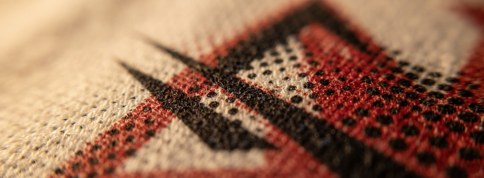
- Simulated process separation is the middle ground apparel decorators use most for photo-realistic designs. It builds the illusion of full color using a small set of carefully chosen spot inks, printed as halftones, rather than true CMYK. It can reproduce thousands of apparent colors with as few as 6 to 8 screens.
Picking the wrong method for the artwork is one of the most common reasons a print comes back looking flat, muddy, or off-color.
Why Screen Printers Can't Skip This Step
Presses print one ink at a time. A screen can only lay down a single color, so any design with more than one color has to be physically split apart before it can be burned into film.
Registration depends on clean separation. Each layer has to line up precisely with the next when it hits the shirt. Sloppy separation work leads to visible gaps, halos, or overlap where colors don't sit where they should.
Dark garments need an underbase. Printing light or bright ink directly on a dark shirt usually looks dull without a white underbase layer printed first. Deciding where the underbase goes, and where it should be "choked" back slightly to avoid a white halo around the design, is part of the separation work, not something added at the press.
Halftone settings change how a print looks and feels. The line screen frequency used for halftone dots, typically in the 45 to 65 LPI (lines per inch) range for simulated process work on apparel, affects both the visual detail and how soft or heavy the ink feels on the shirt. Get it wrong and detail gets lost or the print feels plasticky.
What a Good Color Separation Looks Like
- Each color is isolated on its own labeled layer, with no stray pixels or leftover color bleeding into the wrong channel
- Chokes and spreads are applied correctly, so an underbase and top color don't create a visible white ring or a gap between colors
- Registration marks are placed consistently across every separation so the printer can line up each screen on press
- Halftone frequency and angle are chosen to suit the fabric and the level of detail in the design, not left at a default setting
- Colors are labeled against real Pantone or ink references, not just named "blue 1" and "blue 2"
How Outsourcing Color Separation Saves Print Shops Time
Separating artwork correctly takes a trained eye and a fair amount of trial and error, especially on simulated process work. Getting it wrong doesn't just cost time, it costs screens, ink, and shirts on a misprinted run. Outsourcing this step to a dedicated production art team means:
- Turnaround in hours, not days, most orders completed within 12 to 24 hours, with rush options in as little as 4
- Separations built correctly the first time, regardless of how complex or messy the source art is
- Press-ready files delivered in the format your RIP or film output step needs, so there's no back and forth before a job can run
FAQ: Color Separation for Screen Printing
What's the difference between spot color and process color printing?
Spot color printing uses one solid, pre-mixed ink per screen, usually matched to a Pantone number, so each color prints flat and consistent. Process color printing uses four screens, cyan, magenta, yellow, and black, printed as overlapping halftone dots to simulate full-color photographic images. Spot color is standard for logos and text, while process or simulated process is used for photo-realistic or gradient-heavy designs.
How many colors can be printed with color separation?
Most manual and automatic presses run 6 to 12 color stations, so a spot color job is usually separated into anywhere from 1 to 8 or so screens depending on the design. Simulated process artwork can reproduce thousands of apparent colors using as few as 6 to 8 carefully chosen ink screens, since the halftone dot patterns blend visually on the shirt.
Do I need to send separations, or can the printer do it?
Most print shops expect the artwork to arrive already separated and press-ready, since separating on the fly slows down a production schedule. This is typically handled as a production art step, either in-house or outsourced, before the job ever reaches the press.
How long does color separation take?
Standard turnaround is 12 to 24 hours when outsourced, with rush service available in as little as 4 hours.
Vertex Creative Solutions has been producing accurate spot, process, and simulated process color separations for over 30 years, serving screen printers, decorators, and promotional product companies across the USA, UK, Canada, and Australia.
Explore Artwork Services arrow_forward